

- What is the Analytics tab?
- Overview
- Reports: add, edit, and delete
- Profit and loss
- Balance sheet
- Quick examples
- Limits and access
- FAQ
The Analytics tab is your central place in Synder for reporting and financial visibility. It brings together a self-service report builder powered by AI. Instead of switching between separate tools and report views, you can analyze financial data and generate insights from a single workspace.
What is the Analytics tab?
The Analytics tab is Synder’s reporting hub. It turns the data Synder gets from your sales channels and payment platforms into the reports you actually use, from sales by product or channel, all without leaving Synder or exporting to a spreadsheet.
Reports and the ready-made template catalog now live inside the Overview page — there are no longer separate Templates or My reports pages. Here are the pages you’ll find in the Analytics tab:
| Page | What it is | Who it’s for |
| Overview | A single view of all your saved reports, driven by one shared date range. Add, edit, reorder, and remove reports right here. | Anyone who wants the whole picture at a glance. |
| Profit and loss | Your Profit and Loss financial statement. | Available to organizations with the Per Transaction sync with QuickBooks Online. |
| Balance sheet | Your Balance Sheet financial statement. | Available to organizations with the Per Transaction sync with QuickBooks Online. |
Overview
The Overview page is the first thing you land on inside Analytics. It pulls all your saved reports into a single view.
Note: Every new Synder organization starts with 3 pre-loaded reports — Sales by channel, Gateway Fees (Monthly Trend) by Sales Channel, and Top 5 products by revenue. These count toward your 6-report limit, so new users will see 3/6 reports already in place when they first open the Overview.
How to access it
Open Analytics → Overview in the left-side menu.
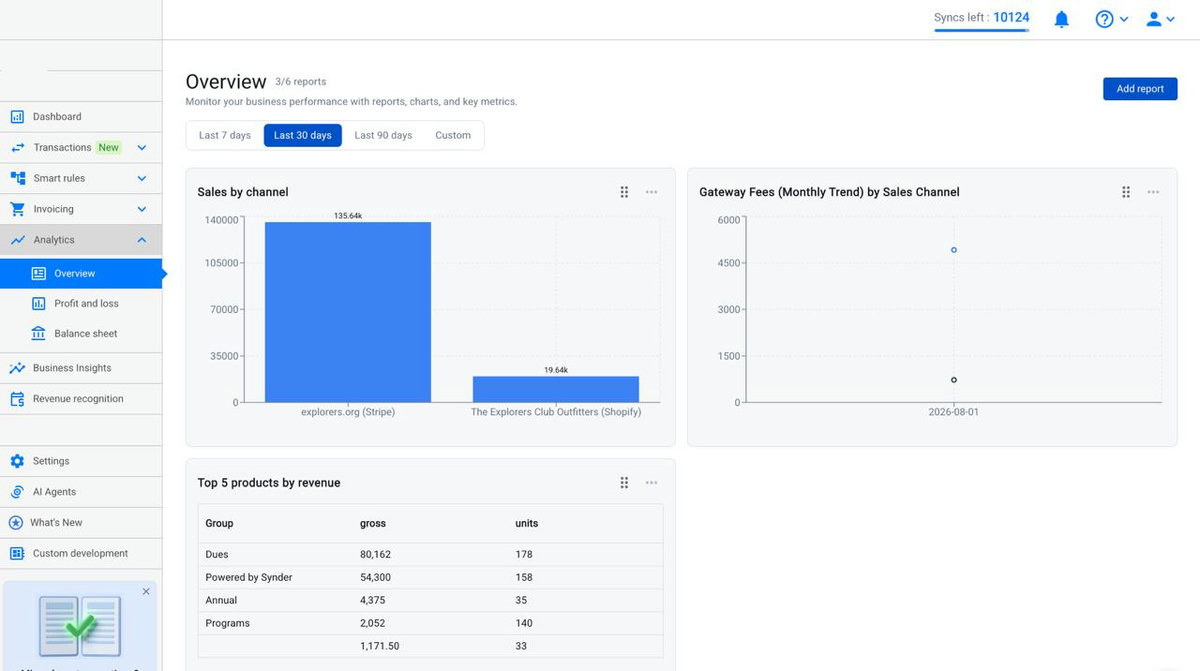
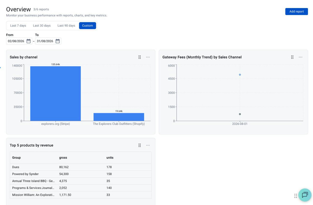
- The date range sits at the top, with quick options: Last 7 days, Last 30 days, Last 90 days, or Custom. Choosing Custom reveals inline From and To date fields.
Custom ranges are available for periods up to 1 year. - The selected range applies to all reports on the page.
Managing your report cards
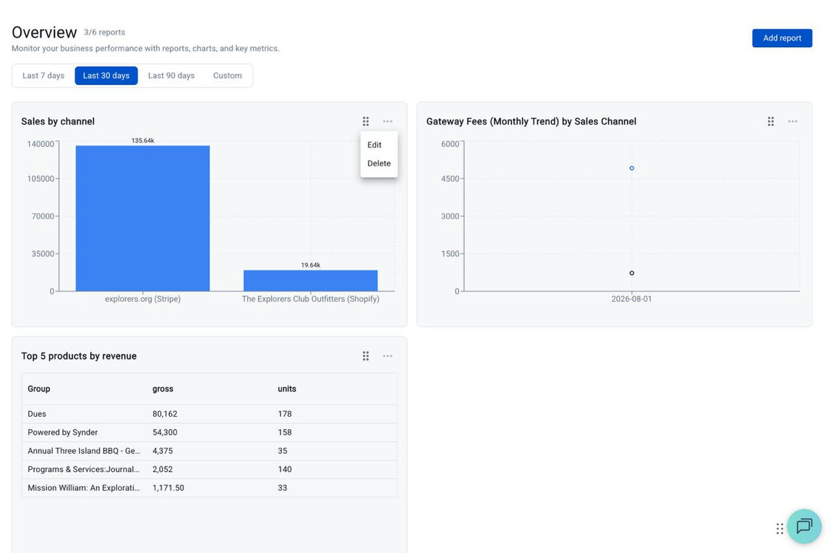
Each report card has two controls in its top-right corner:
- The six-dot handle — drag it to reorder cards on the Overview.
- The three-dot menu — click it to Edit or Delete that report.
Reports: add, edit, and delete
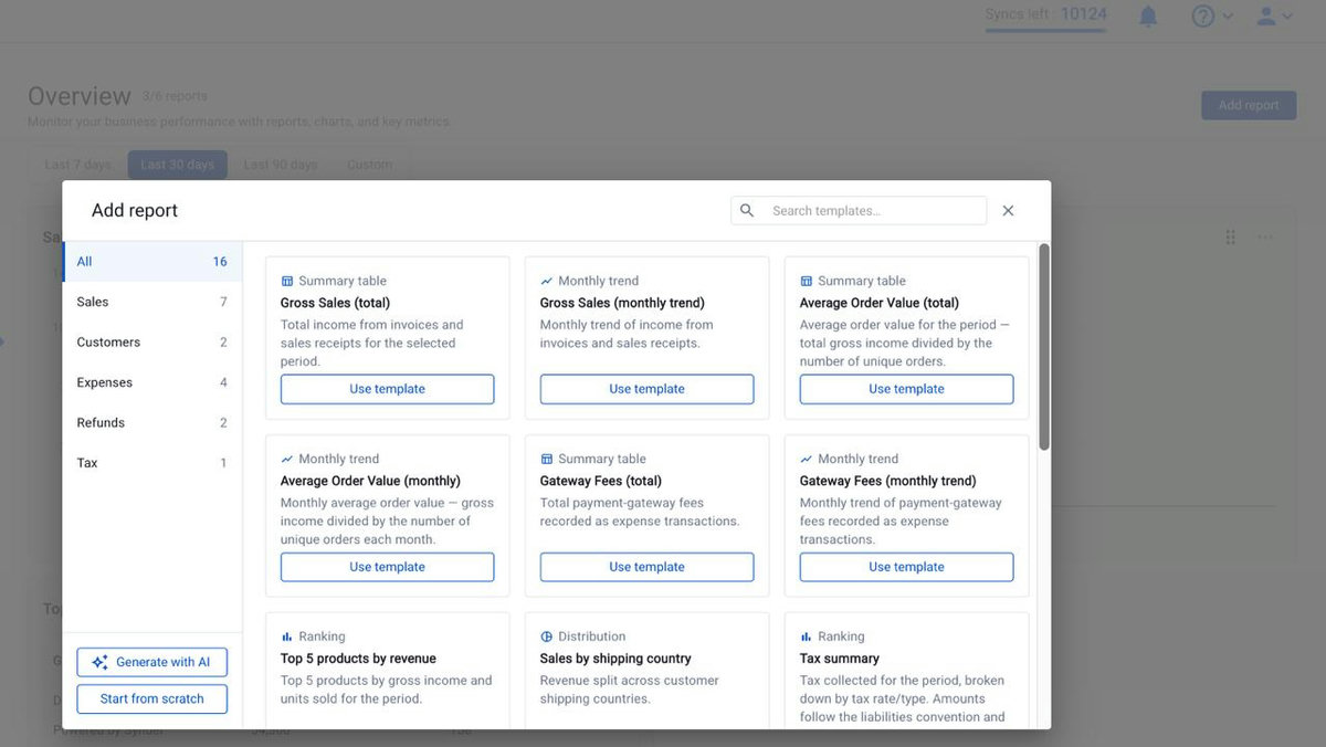
To add a report, click Add report in the top-right of the Overview. The Add report dialog gives you three ways to build, all in one place.
A. Browse a template
The left rail filters the catalog by category — All (16), Sales (7), Customers (2), Expenses (4), Refunds (2), Tax (1) — or use the search box to find a template by name. Click a template’s Use template button and the report is added straight to your Overview. You can edit it anytime afterward via the three-dot menu on its card.
B. Generate with AI
The fastest way to get a working report — no need to know what to group by or which metric to pick.
- Type a prompt like “Top 10 products by revenue for the last quarter, sorted descending” or “Monthly sales totals by country for the past 12 months”.
- The AI builds the chart configuration (chart type, grouping, metrics, filters, sort, limit) and opens it for review.
- A blue “Generated with AI” banner explains why the AI chose this configuration.
- If the result isn’t quite right, “Improve with AI” lets you iterate without starting over.
C. Start from scratch
Full control over chart type, grouping, metrics, filters, sorting, and limit. Best when you know exactly what you want.
The template catalog (16 reports)
| Name | Type | What it shows |
| Gross Sales (total) | Summary table | Total income from invoices and sales receipts for the selected period. |
| Gross Sales (monthly trend) | Monthly trend | Monthly trend of income from invoices and sales receipts. |
| Average Order Value (total) | Summary table | Average order value for the period — total gross income divided by the number of unique orders. |
| Average Order Value (monthly) | Monthly trend | Monthly average order value — gross income divided by the number of unique orders each month. |
| Gateway Fees (total) | Summary table | Total payment-gateway fees recorded as expense transactions. |
| Gateway Fees (monthly trend) | Monthly trend | Monthly trend of payment-gateway fees recorded as expense transactions. |
| Top 5 products by revenue | Ranking | Top 5 products by gross income and units sold for the period. |
| Sales by shipping country | Distribution | Revenue split across customer shipping countries. |
| Tax summary | Ranking | Tax collected for the period, broken down by tax rate/type. Amounts follow the liabilities convention and may appear as negatives. |
| Sales by channel | Distribution | Revenue split across e-commerce channels (Shopify, Amazon, etc.). |
| Channels — monthly side-by-side | Comparison | Monthly revenue stacked across e-commerce channels — one stack per month, segmented by channel. |
| Refunds by product | Ranking | Refunded amount and units per product, sorted by refunded amount. |
| Top 5 customers by revenue | Ranking | Top 5 customers by gross income and unique-order count. Groups by name (approximate — same names merge). |
| Income vs Expenses (monthly) | Comparison | Monthly comparison of income and expenses — one stacked bar per month, segmented by account type. Mini P&L view. |
| Top 5 expense accounts | Ranking | Top 5 expense accounts by spend for the period — answers “where the money went”. |
| Refunds (monthly trend) | Monthly trend | Monthly trend of refunded amount — pairs with “Refunds by product” for cyclicality and refund-rate review. |
Profit and loss
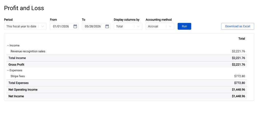
The Profit and loss page shows your income, expenses, and net profit for a chosen period. This financial statement is available for users on Per Transaction sync mode connected to QuickBooks Online.
How to access it
Open Analytics → Profit and loss in the left-side menu, then pick the period you want to review.
What you can do here
- Review revenue, cost of goods sold, and expense categories for any period.
- Compare periods (for example, this month vs. last month) to track trends.
- Drill into specific lines for the underlying detail.
- Export the P&L for sharing or archiving.
> Tip: For a quicker, chart-based view of income vs. expenses, also try the Income vs Expenses (monthly) and Top 5 expense accounts templates. They give you the same story in a visual format and can be saved to your Overview page.
Balance sheet
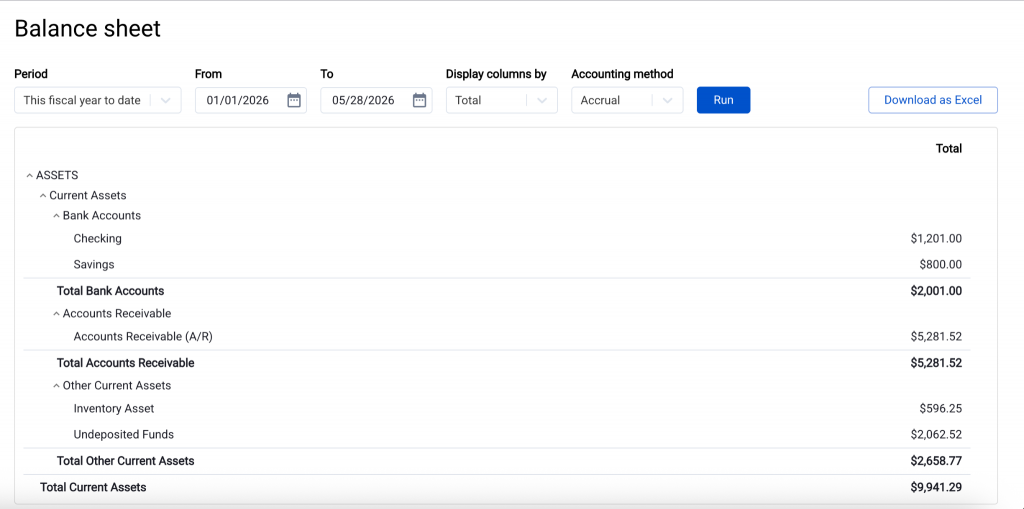
The Balance sheet page shows your assets, liabilities, and equity at a point in time. This financial statement is available for users on Per Transaction sync mode connected to QuickBooks Online.
How to access it
Open Analytics → Balance sheet in the left-side menu, then pick the as-of date.
What you can do here
- Review assets (cash, clearing accounts, accounts receivable, inventory), liabilities (accounts payable, deferred revenue, tax liability), and equity at a chosen date.
- Drill into accounts for the underlying activity.
- Export the report.
Quick examples
A few common questions and how to answer them from the Analytics tab.
“How many units of product X did we sell this month across all channels?”
On the Overview, click Add report → Start from scratch, filter by product, group by channel, measure units and revenue, and show it as a bar chart.
“Top 5 customers this quarter.”
Click Add report and apply the Top 5 customers by revenue template for the chosen period.
“Refunds by channel for the period.”
Click Add report → Start from scratch, filter on refunds, group by channel, shown as a pie.
“Sales dynamics by platform, last 6 months.”
Apply the Channels — monthly side-by-side template, then set the Overview date range to cover the last 6 months.
“Mini P&L and where the money goes.”
Add the Income vs Expenses (monthly) and Top 5 expense accounts templates to your Overview. For the full statement, open the Profit and loss page.
“What’s our current cash position and what’s outstanding?”
Open the Balance sheet for today’s date and review the asset section.
Or, for any of the above, click Add report → Generate with AI and just type the question.
Limits and access
- Each Synder organization can have up to 6 saved reports. To create a new one after reaching the limit, delete an existing report first (via the three-dot menu on its card).
- Reports support date ranges of up to 365 days.
FAQ
How does the AI know what I want?
You describe the report in plain English; the AI translates that into a chart configuration (chart type, grouping, metrics, filters). You always see the result before saving, and a “Generated with AI” banner explains the reasoning. If the result isn’t right, “Improve with AI” lets you refine it, or you can edit it yourself.
Can I edit an AI-generated report afterwards?
Yes. Once the AI has built it, it’s a regular report. Every field is editable, just like a template-based or from-scratch report.
Can I share a report with a teammate?
Reports belong to your Synder organization, not to an individual user. Every user role sees the same Overview.
Can I click into a chart to see the underlying transactions?
Not yet. Reports show aggregates today. Drill-down to the transaction level is on the roadmap.
Need help getting started or have a question this article didn’t cover? Reach out to Synder Team via online support chat or email with any questions you have.
