

With the rapid development of technology and an even more rapid increase in the amount of generated data, data analytics defines the success of any business trying to keep up and provide the best customer experience. Competition in the marketplace is growing fast, and so does big data. That’s why the need to produce data-driven decisions promptly has never been more critical. Unfortunately, it means that the timeline for coming up with solutions is getting shorter and shorter. This is when data science, alongside data visualization, comes into play.
Research of more than 400 large companies conducted by Bain & Company shows striking results – businesses that adopted data analytics and use data visualization daily are doing much better than their competitors and delivering in revenue. The companies in question are:
- 2x more likely to get to the top quartile of financial performers in their respective industries;
- 5x more likely to arrive at bottom-line decisions faster than their competitors;
- 3x more likely to be highly effective when executing these decisions;
- 2x more likely to make data-driven decisions relying on data analytics.
Not bad when you’re trying to speed up the way you solve issues and plan your future strategy, right?
Today we’re going to delve into what data visualization is, its function, why it matters for your business, and what data visualization tools you can use to streamline data analysis and understand trends for better and faster decision-making.
Contents:
1. What is data visualization?
2. Components of data visualization
3. Types of data visualization: representation of data analytics
4. Why is data visualization important?
What is data visualization?
The amount of data generated by your business grows exponentially every day. Revenue, performance, inventory, and customer data, among others, seem to be piling up faster than you can process it; that’s why making sense of it can be pretty challenging.
Data visualization allows you to turn the raw data into visual representations that are easily understood and interpreted. Typically, visualizations come in the form of charts, diagrams, graphs and maps and allow you to trace and analyze trends and patterns in your KPIs.
Components of data visualization
While data visualization is creative, it’s also functional and insightful. It’s designed to showcase different types of data sets in various formats to gain insights into the intricacies of your business.
Any digital marketing leader knows that data analytics may be presented in various visualizations depending on the building components. Let’s take a look at the most frequently used components and types of data visualization that give you a sense of power over your data.
Time-series
Time-series visualizations are integral to data visualization and illustrate how a particular variable changes over time. Typically, line and area charts are used to depict the dynamics of the variable in question. Common use cases for these charts include, for example, stock price performance, health statistics and various chronologies.
 |  |
| Line chart | Area chart |
Ranking
Data analysis is unimaginable without ranking, demonstrating a certain item’s position in an ordered list. It’s typically used when, for example, when a chief marketing officer describes business performance or expert comments on election results. Here the analysts mainly utilize such data visualization elements as ordered bar and column charts.
 |  |
| Ordered bar chart | Ordered column chart |
Comparison
Category comparison in data visualization allows one to examine the data from multiple categories in contrast. You’re likely to come across such charts when you’re reading about different types of analytics, such as comparing average income across different countries, popular venue times, and team allocations, for example. The most frequently used types of charts in this regard are bar, bubble, and multi-line charts.
 |  |
| Bubble chart | Multi-line chart |
Part-to-whole
Part-to-whole charts are an essential part of big data visualization as they allow you to show how partial elements add up to a total. For example, you’ll need those charts when describing your budget and the consolidated revenue of product categories on a percentage basis. Pie, donut, and stacked area charts fall into the category.
 |  |  |
| Pie chart | Donut chart | Stacked area chart |
Correlation
Correlation between certain variables is usually shown in data visualization with the help of bubble and scatter plot charts. For example, you can use those when you want to explain the direct effect of the number of users on your revenue.
 |
| Scatter plot chart |
Geo mapping
Geo-mapping is an integral part of analytics and data visualization when you need to analyze the data by geographic region, say, your revenue generated in multiple countries, states, or cities. We usually use a choropleth, a shaded or pattern-filled map in such cases.
 |
| Choropleth |
As you can see, data visualization allows for many different charts that can be opted for to reflect the necessary information. But if you’re using specialized software, chances are these charts are preselected for you, and the info is presented in a certain way. So let’s go through the main types of data visualization typically used in data visualization software.
Types of data visualization: representation of data analytics
The most common data visualization types utilized in most data analytics software are charts, pivot tables, KPI widgets, and dashboards. These visualizations are typically used by a variety of experts within a company, such as, for example, a digital marketing leader or chief marketing officer, when describing business performance.
Data charts
Charts are easily the simplest way to present analytics. They’re a perfect tool for visualizing any type of data that can be further analyzed and interpreted. Each chart provides a wide variety of options for data analysis. The only problem is choosing the right ones to avoid getting lost in lines and graphs. The most frequently used charts were described above.
Pivot tables to represent data
A pivot table visualization allows for a tabular view of data with the ability to sort, rearrange, and summarize large quantities of data. In addition, the table can be customized for more straightforward data analysis and consumption – you can use filters, and rotate (‘pivot’) the rows into columns and vice versa.
KPI widgets for data representation
If you want to highlight some key metrics in a dashboard to monitor it as often as possible, KPI widgets are here to help. You can choose either chart type or single-numbered widgets where you’ll typically be able to see not only the metric but also comparison indicators and targets. The former is suitable for highlighting emerging trends, the latter – for showing progression.
Data dashboards
Any e-commerce business owner knows what a data dashboard is. Within the data visualization framework, dashboards provide you with the most comprehensive approach to data analysis. An analytics dashboard lets you combine and explore multiple KPI widgets and reports on a single page. Usually, analytics dashboards have a flexible layout where the users can dynamically filter the information they want to see. Moreover, dashboards enable the discovery of data insights such as identifying trends over time, finding reasons for specific patterns and exploring hypothetical situations, forecasting in short- and long-term perspectives, creating accurate and detailed reporting, etc.
Why is data visualization important?
The challenge with data analysis lies in connecting the dots. When you’re looking at raw numbers, you need time to make sense of this information. More often than not, you don’t have time to spare on this process. Data visualization transforms raw data, possibly from different data sources, into categories and indicators that can be immediately used as powerful business insights for fast and effective decision-making.
Data visualization can help you:
- Identify areas that perform best or need improvement and attention.
- Spot trends in your audience’s customer behaviour and your business’s performance and/or compare them with the relevant metrics in the whole business community.
- Predict sales volumes and revenue.
- Foresee potential risks and losses and address issues before they emerge.
- Pinpoint relationships and patterns, etc.
Data visualization brings data to life and drives your business forward. If you’ve already had some experience with data analysis or if you’re just thinking of implementing it into your business, it’s helpful to have data visualization software that will automatically compile the necessary data in the background. Let’s have a look at the top 5 data analysis and visualization tools that can streamline your performance, provide you with some ‘a-ha’ insights and help you become a digital marketing leader in your industry.
Read our article and learn more about creative ways of presenting business insights.
Data visualization tools
1. Interactive data visualization with Google Chart
Google Chart is a cloud-based data visualization tool that enables businesses to present statistics in the form of graphs, pie charts, pictographs and more. Google Chart tools are compelling, easy to use, and accessible. The solution offers a great choice of charts, allows you to customize them, and connect them to an interactive dashboard.
You can create a chart and embed it in a webpage using your data. Once the data and formatting parameters are embedded in an HTTP request, Google returns a PNG image of the chart.
One of the most popular and accessible tools on the market with easy navigation, Google Chart allows you to create powerful visuals even if you’re not an expert.
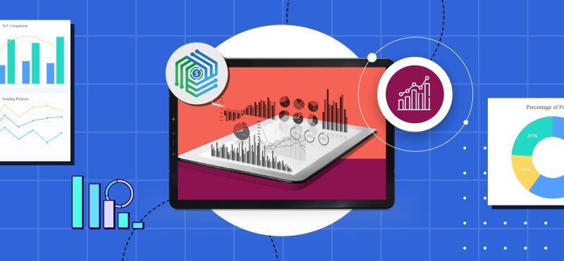
2. Data visualization with Synder
Synder is an intelligent platform to manage your business finances better, smarter and faster. This accounting software boasts the largest number of features on the market: seamless integration with all your platforms, automated finance management with no manual work involved, immaculate reconciliation and P&L reporting, flawless withheld tax management and inventory tracking, and others.
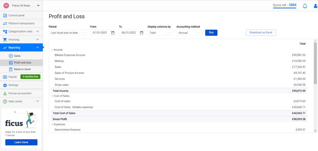
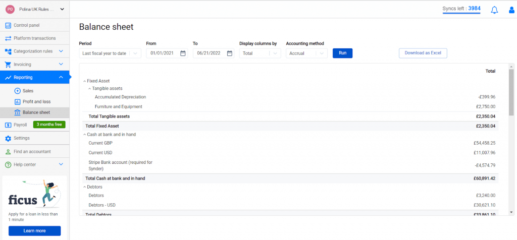
The latest addition to the reporting features – Synder Business Insights – is a dream-come-true solution for e-commerce business owners who want to have the most important KPIs at hand at all times and understand how these numbers affect their business. This feature is a set of reports based on the detailed data captured by Synder from all connected platforms and gateways that provide you with valuable visualized insights into the performance of your business, allowing you to make prompt data-driven decisions.
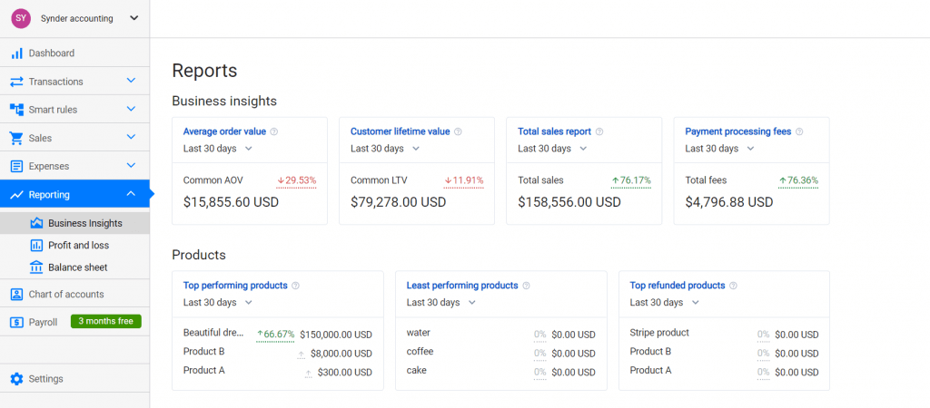
With Synder’s Business Insights, you don’t need additional data visualization tools – your KPIs are right where you need them. In addition, the solution offers easy navigation, so you never lose your metrics. Visualize business insights and discover how they can change how you use data analytics – book office hours to see it yourself!
3. Data visualization with Tableau
Tableau is a reliable data visualization software which is used for reporting and analyzing vast volumes of data. Tableau offers live analytics with interactive dashboards and helps people view and understand data.
Being one of the best visualization tools, it allows users to create maps, indicators, and many more visuals and provides them with actionable analytics. It’s a perfect choice if you want your employees to understand better how to work with data, analyze it and take insights from it.
4. Data visualization with Zoho Analytics
Zoho Analytics is a self-service BI and analytics software available both on the cloud and on-premise, whose function is to let you create dashboards and analyze data. It enables you to model, structure and clean your data to create and share dashboards and reports with the easy drag-and-drop interface.
With Zoho, you can manage and automate various business processes across your organization and get a complete picture of any team’s progress.
5. IBM Cognos Analytics for visualizing data
IBM Cognos Analytics with Watson is a BI tool that lets you clean and connect your data and create straightforward visualizations. As with many other tools, it integrates different types of functionality – analysis, reporting, dashboards, modeling, and others. However, the software stands out from the competition as it uses AI to explore and predict data which also results in higher costs, more complex interactions and requires formal training.
Final words on good data visualization
Regardless of the size of your business, the skills of collecting, analyzing, and acting on the information available will provide tremendous support for your business, hence, are an absolute must. Data visualization is a great way to answer essential business questions and transform granular data into flat-out actionable business information. What makes data visualization important is the amount of time and effort it saves your business. Data visualization tools allow you not only see your KPIs, but also unify data, trace relationships and patterns in behavior and performance and make impactful data-driven decisions. Good data visualization is a real source of power over your business performance. Determine what works for you best, and forget about the Microsoft Excel spreadsheets! Make data analytics part of your business strategy – get ahead of your competition!


.png)