It’s no surprise that on Etsy, you can customize many aspects of your shop, especially the homepage. Think of it as your creative playground, where you can add your logo, tweak product categories, set store policies, and more—a true playground for the artsy people.
Okay, maybe crafting the Etsy storefront doesn’t sound thrilling, but let’s keep it real: this home page is your shop’s grand entrance and first impression for every customer. So, let’s dive in and break down the whole concept of the Etsy storefront, step by step!
Key takeaways:
- Etsy storefront is a home page for your store introducing both the brand and the products to the customers.
- The more information you provide on the home page, the more clear expectations the buyers will have.
- Optimizing your Etsy storefront should be an ongoing process, ensuring potential customers always have access to the most up-to-date information.
Contents:
1. What is an Etsy storefront?
2. The key elements of the Etsy storefront
3. Best practices for optimizing the Etsy storefront
What is an Etsy storefront?
Let’s keep it simple: an Etsy storefront is basically the home page of your online shop on the Etsy platform.
The Etsy storefront showcases your shop’s name, logo, and all the visual branding goodies, like a banner and shop icon. The storefront displays all the products offered on this Etsy account, organized into categories for easy browsing, and other customizable details that can be useful for the buyers, such as shop policies and shop announcements.
Overall, an Etsy storefront is a powerful tool for sellers to establish their brand, reach a global audience, and manage their ecommerce business effectively on Etsy.
💡 Tip: Focus on creating a visually appealing storefront with a consistent aesthetic that matches both your vision and the products you’re selling.
The key elements of the Etsy storefront
Don’t stress about what to display on your home page—Etsy’s got your back. Unlike running your own website, Etsy provides the potential info blocks to showcase on the home page. Here’s what a potential Etsy storefront can look like:
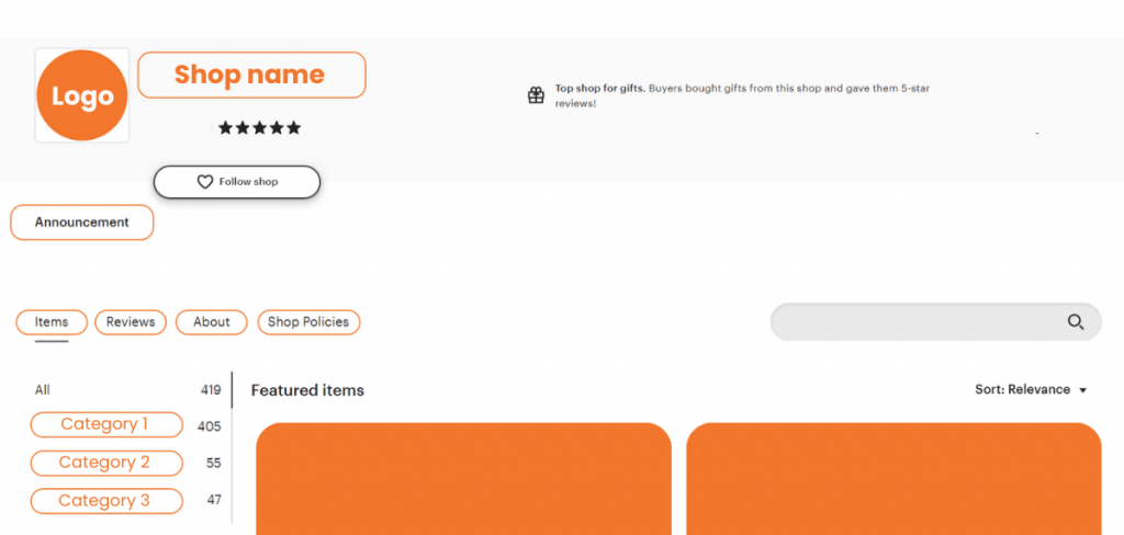
This is a solid starting point, but it’s worth doing a little detective work. Check out how other sellers in your category set up their storefronts. Pay attention to their customization and the wording they use for their products (this will help with SEO optimization, but more on that later).
Now, let’s break down the main elements of an Etsy storefront. Since we’ve already provided the template of a real Etsy shop, we’ll proceed in the order shown in the picture.
#1. Shop name and logo
These are the first things customers see on your Etsy shop. They serve as the store’s identity, so be thoughtful when choosing them. A unique and memorable shop name, along with a professional logo, helps establish brand recognition.
Note: Remember, the shop name you pick during onboarding will directly impact the URL of your Etsy shop.
#2. Announcement
The next one is the shop announcement.
This is your announcement board for important updates like new product releases, sales, and other news. It’s also a great spot to give your social media a shout-out and draw some traffic to your profiles.
#3. Listings
Next up, the product section. Each product available for sale is showcased in individual listings. These product listings include detailed descriptions, photos, pricing, and tags to help customers find what they’re looking for.
A pitfall for many Etsy sellers on this step is setting prices. Understanding Etsy product pricing helps you strike a balance between a fair price and the value you place on your time and craftsmanship. While high prices might scare some away, prices that are too low can make buyers question the quality of your products.
Always keep in mind additional expenses such as Etsy seller fees (payment processing fee for Etsy Payments, listing fee, etc.), taxes, and shipping costs before settling on the final price.
#4. Categories
As your Etsy business grows, so will your product list. That’s why Etsy provides an option of dividing products by certain categories so it’s easier for buyers to find what they want.
Categories don’t have to be complicated—simple divisions like tops, shorts, pants, etc., can make a big difference if you’re selling clothes, for example.
#5. Reviews
What others say about your store can be a game-changer for hesitant buyers. The reviews section showcases feedback from previous customers, often including photos of the delivered goods, which boosts your store’s credibility.
Reviews are rated on a 5-star system, giving potential customers a quick overview of your shop’s reputation.
#6. About section
This area lets you share your story, the inspiration behind your products, and relevant background information, creating a personal connection with your customers. You can also introduce your shop members, highlight your social media, and mention any partners you have.
Overall, this section is all about letting customers get to know you better, creating a stronger bond between buyers and your business.
#7. Shop policies
This includes all the crucial information about how long does Etsy take to ship, payment options, returns and exchanges, and cancellations.
Clearly outlined policies set clear expectations for your customers and help prevent misunderstandings.
Best practices for optimizing the Etsy storefront
Managing any online business is an ongoing process. There’s no one-size-fits-all formula for boosting sales and growing your customer base. If you want to grow, you need to know how to adapt to changes and which strategies to implement first.
Let’s go through the most common ones.
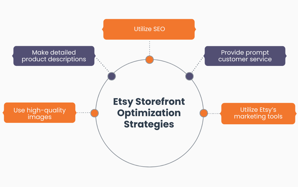
1. Add high-quality images
First impressions matter, and on Etsy, that means stellar product photos.
Invest in professional photography or learn basic photography skills to ensure your images are clear and appealing. Show your products from various angles, including close-ups of important features, to give customers a comprehensive view.
Showcase your items in use to help customers envision how they might look or function in their own lives. The more they can picture it, the more likely they are to buy it.
2. Make detailed product descriptions
A picture may be worth a thousand words, but a great description can seal the deal. Provide comprehensive details about each product, including dimensions, materials, and care instructions. Use descriptive language to tell the story of your product, highlighting its uniqueness and benefits.
Use bullet points, headings, and short paragraphs to make your descriptions easy to read.
3. Utilize SEO
Now, to the part we’ve mentioned in the beginning – search engine optimization. Simply put, this means using the most popular keywords that potential customers are searching for in your product names and descriptions. This is where researching your competitors can really pay off.
Write clear, concise titles that include primary keywords. For effective search engine optimization, avoid keyword stuffing, and make sure the titles are readable. Utilize all available tags and attributes for each listing to improve search visibility.
4. Provide prompt customer service
Providing good customer service also can’t be ignored.
Be polite, professional, and thorough in addressing all questions. Handle issues or complaints promptly and fairly, showing customers that you value their satisfaction. Personalize your communications where possible to make customers feel valued and appreciated.
5. Utilize Etsy’s marketing tools
Growing means learning and taking advantage of new tools.
Invest in Etsy’s advertising platform to boost the visibility of your listings. Experiment with different onsite and offsite ads strategies to see what works best for your shop. Use Etsy’s built-in tools to run sales, offer discounts, or create coupon codes to attract customers and boost sales.
Link your Etsy shop to your social media platforms. Share your products and shop updates on Instagram, Facebook, and Pinterest to drive traffic to your storefront.
Conclusion
Summing up, customizing your Etsy storefront isn’t rocket science, but it does require a thoughtful approach. Keep your store’s key concept in mind and design your homepage to showcase your products in the most appealing way.
Even if your first attempt doesn’t turn out into what you expected, it’s not a failure—it’s just one of those bumps in the road on a learning journey. Experiment with different approaches, strategies, and concepts. With a bit of patience and creativity, you’ll eventually land on the perfect formula that works for you.
Share your thoughts
Have you already set up the Etsy storefront and now are looking for ways to optimize it? Or are these only your first steps? Tell us about your experience with Etsy in the comments section below!


